

Background
Oracle HCM Cloud has been leading the industry since the revolutionary product in 2011. Now, the surging demands of employees/employers self service are requesting a mobile friendly redesign for our product. I worked with both central UX team and Recruiting product team to enhance the existing product and develop new features and apps. Central UX team has 26 designers. Recruiting product team consists of 2 senior designers and 11 product managers.
Objective
Redesign existing HCM products to fully mobile responsive apps.
Build a design system with UX patterns and UI components.
Enhance current features while develop new features.
Roles
Product Design Lead - I led one Sr. Product Designer and collaborated closely with the Product Managers, Dev Team, and central UX design team. I was responsible for leading the entire design process and involved as an active contributor at each stage in the design process.
Design System & Patterns - I was chosen to contribute design concepts for developing a design system. I participated in builting the foundation for a library of design patterns and components.
User Research & User Testing - We began with competitive analysis and user interviews to discover different roles and interactions. As the design solidified, we tested with users in person in Dallas HCM World as well as through online user testing platforms.
UX Design - With the understanding of our users as well as the technical limitations of feature customization library, we designed and refined a user experience that would be instructive to novice and experienced users.
Responsive UI Design - We wanted to ensure that the product meet KPI Metrics. Some data visualization features that made sense for a desktop experience were not necessarily appropriate for the mobile use context. Through user testing, we designed a UI that was clear and easily digestible for users.
Before Mobile UX


After Mobile UX
Prototype of 4 flows: Add Absence, Change Personal Details, Change Contact information, Promote
High-Fidelity Mockups - Landing Page


Metrics & Revenue Growth
After Mobile First project successfully released in the market in 2018, it brought to Oracle $ 775M revenue with 22.5% growth rates and 27,000,000 users increase.

Analytic Data showed Oracle leadership progress made in the HCM product field in the year of 2016 - 2019 (Source: Gartner).
In 2016 and 2017, before Mobile First was launched, Oracle’s leadership was behind Workday and closely after SAP. In 2018 and 2019, after the product release, Oracle’s leadership jumped to No. ONE in the HCM product market.

Competitive Analysis
Competitors Directions

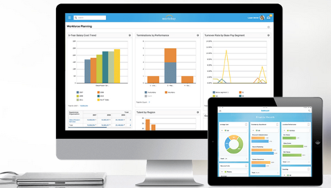
Workday Native mobile applications are still being invested in as they produce a better experience. Its visual design gives the appearance of responsive design. Native solutions are used to give optimal user experiences.
Salesforce uses responsive design techniques to provide device-optimized layouts, a stacked single column layout for phones, and a side-by-side, two-column layout for tablets.

SAP Fiori is a collection of apps with a simple and easy to use experience for broadly and frequently used SAP software functions that work seamlessly across devices and platforms.

User Research
Goals
Gain a deep understanding of how Recruiters and Hiring Managers:
1. Are organized and their key roles and interactions
2. Manage sourcing effort from beginning to end. What data sources are used? What are the success metrics?
3. Track and manage interactions with prospects and candidates
Methodology
Followed Oracle UX Design and Research Methodology guideline, we used user interviews and personas in the early Discover and Requirement stage. 25 user interviews were conducted in the form of in-person or Zoom interview. Each at 60-minute per interview.

User Interviews
Screenshots of two of the participants during the interviews.


Based on our user research, 5 personas were created to help guide design process and solve design challenges.
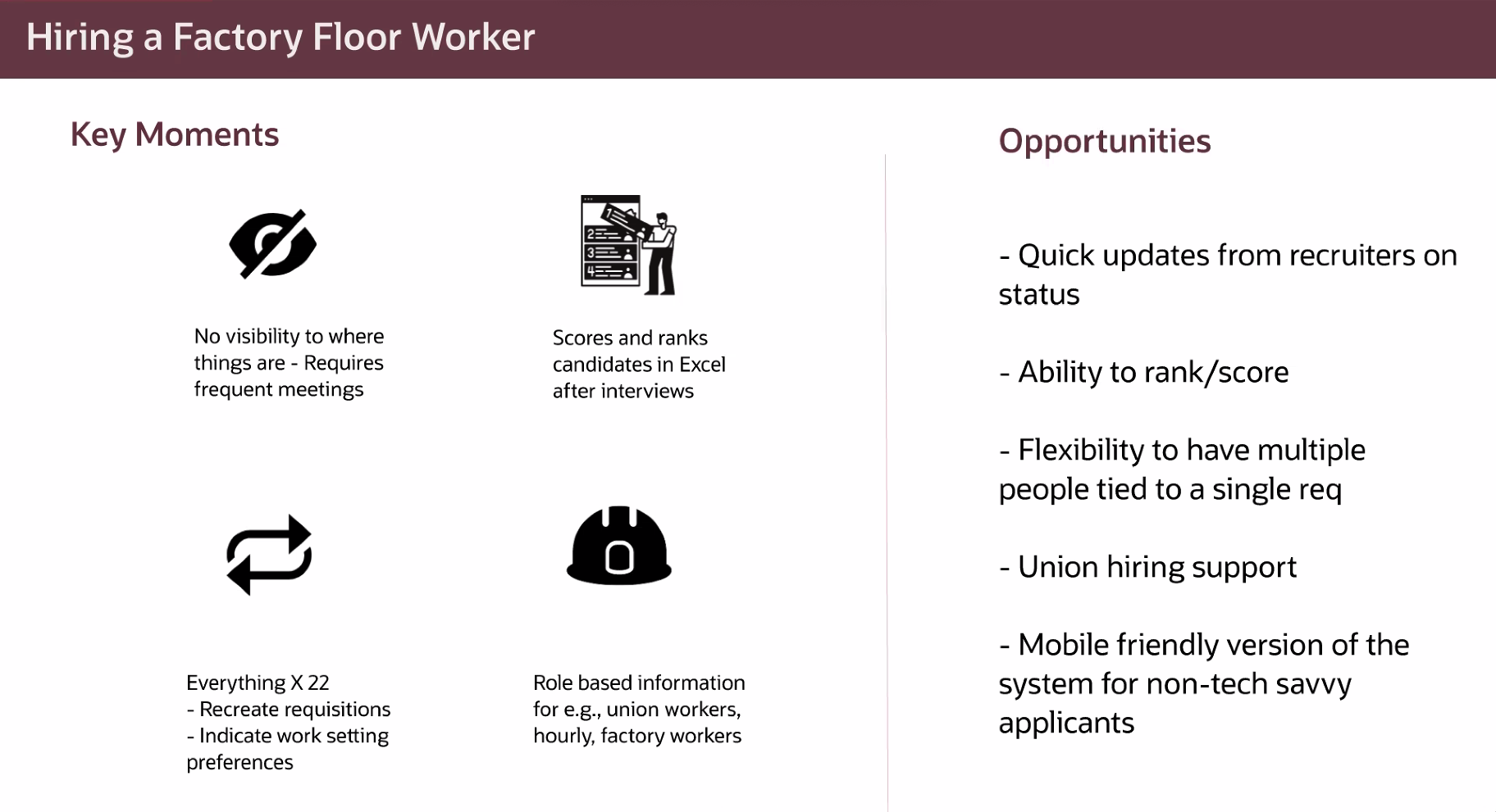
Factory Hiring Manager
Campus Hiring Recruiter
Professional Hiring Recruiter
Executive Hiring Recruiter
High Volume Retail Hiring Recruiter


User Goal
We refined the user goals in each phase and state during the entire recruiting cycle.


Design & Iterations
MVP Flow
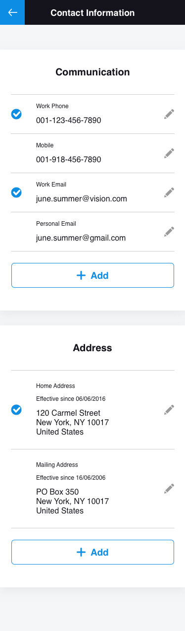
We started from MVP - Add Contact Information flow. It was chosen as the MVP flow as it’s the most common flow in HCM products and it has the basic edit & read-only mode. Below is my original proposal.


Iteration - 1 - Container Added
Components were created at this stage. Container helps to organize the content in a certain area. In the HCM applications, it usually requires a large amount of content.


Iteration - 2 - CGP Pattern Created
CGP (Compact Guided Process) was the first UX pattern created to guide user through all the steps until all steps are complete.
26 UX patterns were created in total. My contribution includes participating the creation of 7 patterns: CGP, Attachment, Form Layout, Inline List Edit, Faceted Search, Landing Page, Toolbar. See the CGP flow chat below.

CGP aims to resolve the current desktop train stop design issue. Train Stop design is not easy to be transformed into mobile responsive design because of the horizontal constrain.
Example of a 6-Train-Stop (it’s common that Train-Stop can take 5 - 7 stops, in Recruiting Create Requisition, it takes 12 stops)

CGP resolved this issue by placing the stops vertically instead of horizontally. By clicking “Continue“, the section(stop) closed automatically. User will be guided to the next section. When the task flow is completed, Call to Action button “Save“ or “Submit“ will be enabled so user can finish the task.


Iteration - 3 - Edit Mode Exploration
Edit Mode and Read-only Mode are most common patterns for hiring managers/recruiters/employees to manage the content. Due to the real estate concern, we explored different versions (1 and 2 and 3 columns) of edit/read-only mode. The first version is one column center aligned component for Edit Mode.

Iteration - 4 - Adopted Version
Below are the two MVP flows adopted design for the Mobile First project. The first one is section edit for adding Contact Information. The second one is CGP for Promote. Compact, simple, engaging, highly usable, versatile, commonly used in many flows.


Usability Testing
When the design was solidified, we tested increasingly more clickable high fidelity prototypes with customers in person in OOW and Dallas HCM World as well as through online user testing platforms. In OOW and Dallas we had Customer Feedback Sessions asked users to go through the promote flow prototype. User reactions were documented at each stage of the testing.
Objective
Gather usability feedback and overall impressions of the MSS Change Salary and Reassign Direct Reports actions
Assess the ease of use and discoverability of key features
Incorporate feedback into the designs and improve the user interface (UI)
Requirements
Line Managers. Have at least 1 direct report
Has been in their current position for at least 6 months
Must be familiar with salary adjustment and reassigning direct reports
Session Format
1-on-1 feedback sessions conducted in person with 10 participants
Each session was 1 hour long
Participants were given 4 tasks to perform on a prototype
High-level Findings
What worked well
8/10 Participants liked the UI and felt that it was easy to use
6/9 Liked being able to select multiple individuals in one flow
6/9 Liked “batching” the process (i.e., being able to send reports to different managers in the same screen)
8/9 Liked how search worked. Specifically, being able to bring up information from multiple fields (e.g., both name and manager’s name)
Areas that need improvement
3/10 Felt that QA screen space was not allocated correctly
9/10 Wanted more specific reasons for salary change
5/10 Expected to see background information to support change salary

(7/9) Expected to be able to select or drill down to indirect reports in Person Selector
(9/9) Did not understand “Manager Type”
(6/9) Were confused why “Add Directs” followed “Reassign Direct Reports”
Detailed Findings by Task

Usage Metrics Testing
Central UX Research team tested Usage Metrics at Evaluate stage. Test results revealed 80% users completed the Promote journey in less than 2 minutes, while the previous version before Mobile UX took about in average 5 minutes. It showed the accuracy and completeness with which users achieve their goals were substantially increased.

Customer Feedback Platform
Customers can directly submit their feedback to Customer Connect platform. It’s the place for sharing customers’ ideas, voting and discussing any existing issues about features and designs.

Telemetry Analysis (2019-2020)


Designing Recruiting Flows
My role for creating & building design system and UI components and UX patterns was successfully fulfilled. I returned back to my team and led 23 flows for Recruiting product. We started with competitors Research, conducting user testing through the discovery process, iterating draft wire-frames.
Sketching Wire-Frames

Based on a design system we built with basic patterns and components, while we iterated the designs, we were continuously developing the design system. I worked together with other 28 designers, we delivered more than 60 products in less than 3 months. Below are the first 8 flows I completed for Recruiting.
ICE (Internal Candidate Experience) Landing Page

Job Search Result Page - Card View

ICE Flow Chat - 5 Flows: 1. Search/View Jobs, 2. Apply a Job, 3. View/Accept Offer, 4. Refer a Colleague, 5. Job Search Activity

Candidate Pool Flow Chat
