
Background
Suzy possessed two powerful but disconnected assets:
CrowdTap, a large-scale participant community
Suzy Core, an enterprise management portal
What Suzy lacked was the bridge between them—a product that allowed enterprise teams to directly conduct research with Suzy’s own participants. In a fragmented market where competitors offered either quantitative or qualitative tools and relied on external recruitment, Suzy had a rare opportunity to build an integrated, defensible insight platform grounded in its own ecosystem.
Outcome & Impact
Outcome
Designed and launched Suzy’s first unified quant + qual research platform
Created a single workflow integrating recruitment, scheduling, live moderation, and insights
Launched June 2022
Impact
Achieved 267% YoY annualized growth within one month
Generated $2.38M ARR, covering 35% of the following year’s revenue target
By 2025, Suzy reached $68.7M in annual revenue
Adopted by enterprise clients including Microsoft, Amazon, American Express, and Coca-Cola
My Role & Leadership
Product Design Lead
Led a team of 7 designers
Partnered closely with Product, Engineering, QA, Marketing, and Research
Owned:
End-to-end experience for Suzy Live Focus Group
Mixed-method workflow design
Usability testing and iteration
Design validation against business and technical constraints
Today’s problem
Enterprise research workflows were deeply fragmented:
Quantitative surveys and qualitative interviews lived in separate tools
Recruitment relied on external panels
Insights arrived late and disconnected from decision-making
This fragmentation made research slow, costly, and difficult to operationalize.
Strategic Opportunities
Suzy’s unique advantage was CrowdTap—its own participant ecosystem.
By unifying quant + qual + recruitment into a continuous workflow, Suzy could offer an end-to-end research platform that competitors could not replicate.
Key Design Decisions
Decision 1: Unifying Quantitative & Qualitative Research
Instead of treating quant and qual as separate products, I led the decision to design them as a single continuous workflow.
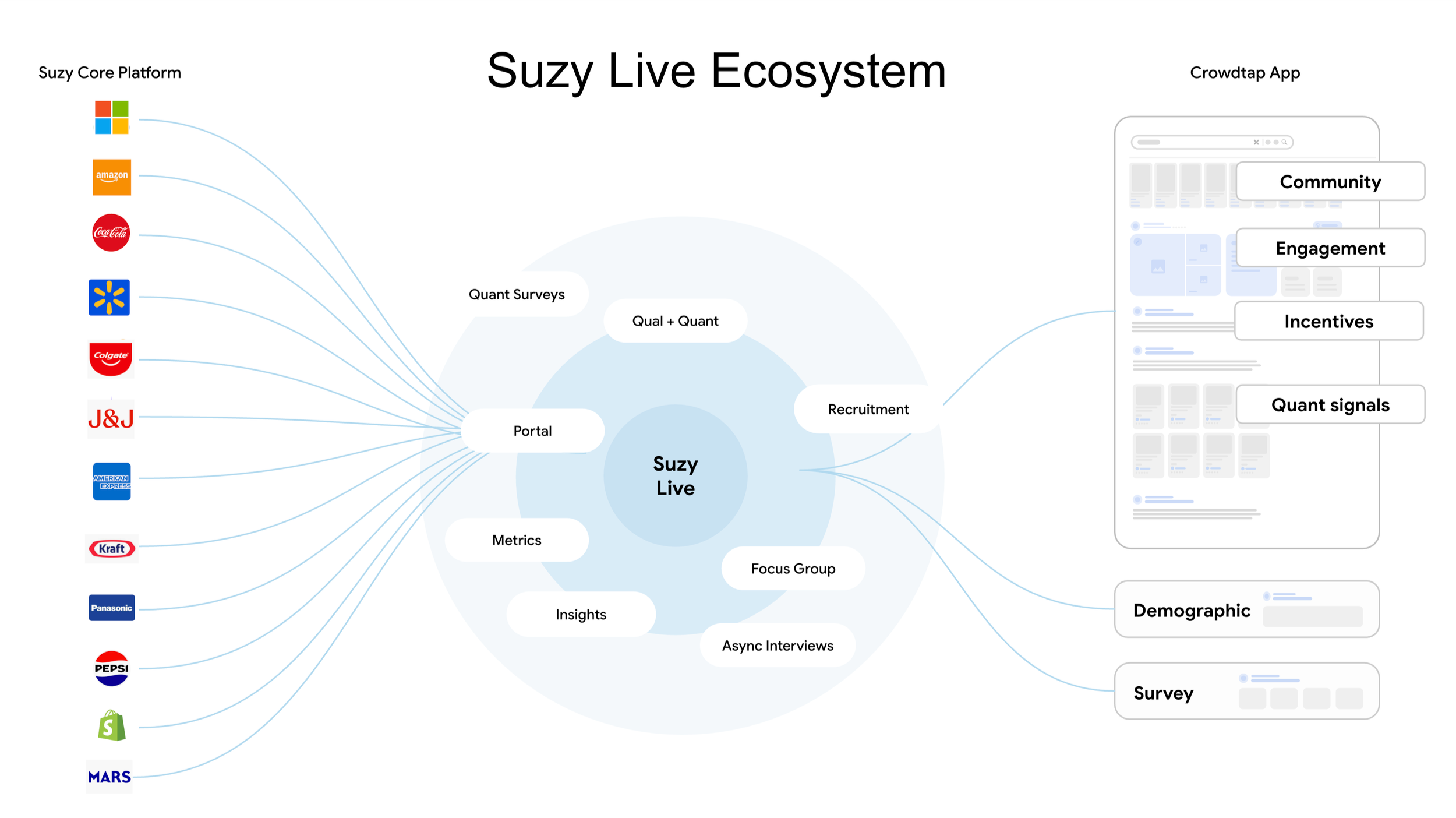
Unified research workflow integrating quantitative surveys, qualitative interviews, and participant recruitment into a single system
Outcome: Enabled teams to move seamlessly from metrics to meaning without switching tools.
Decision 2: Designing for Real-Time Insight
Research insights needed to surface while studies were still running, not after.
Outcome: Allowed teams to act on insights in real time, shortening decision cycles.
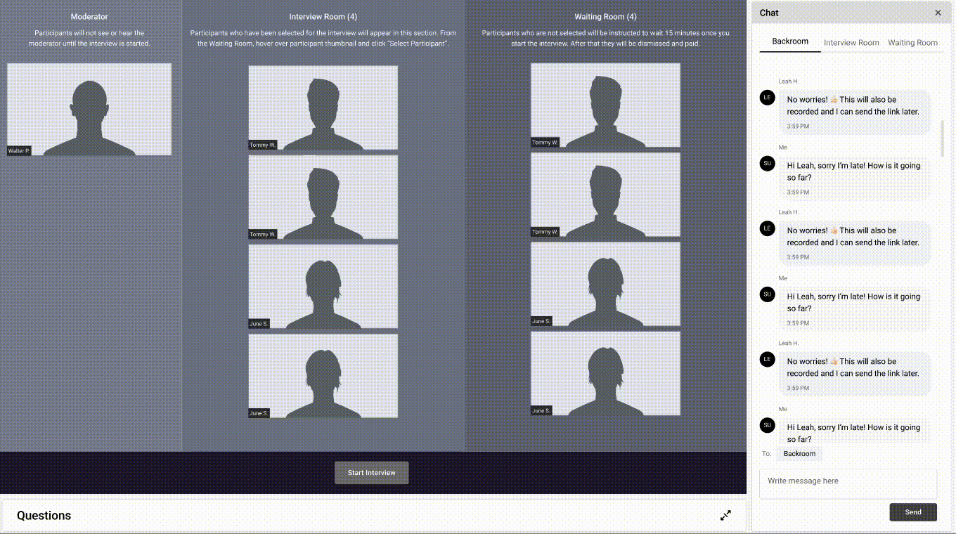
Decision 3: Supporting Multiple Invisible Roles
Focus group research involves moderators, participants, note takers, and observers—often invisible to one another.
Outcome: Designed role-based experiences that preserved research rigor without increasing cognitive load.
Experience Highlights
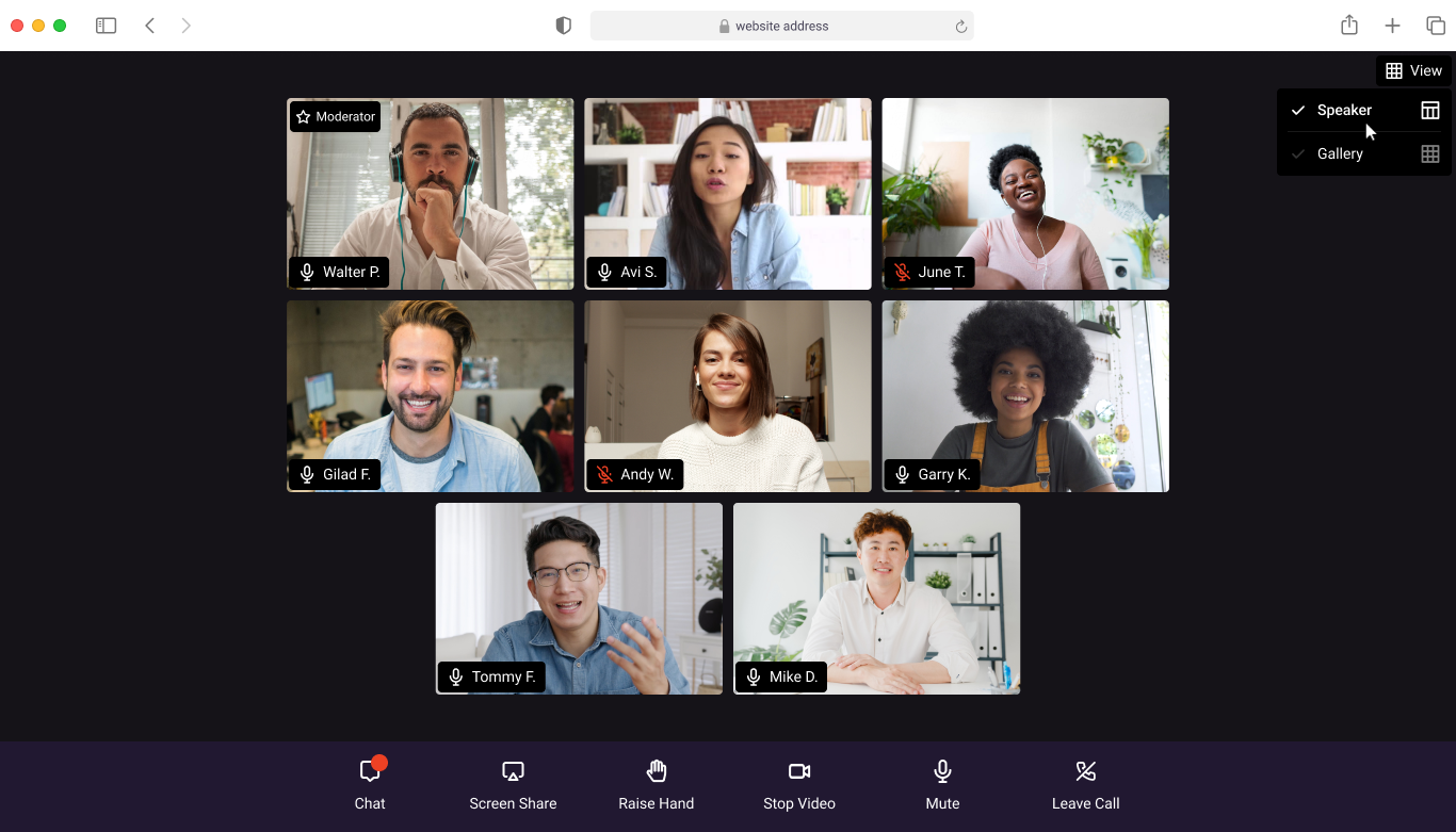
Live Moderated Focus Groups
Participant flow management
Backroom collaboration
Real-time moderation controls
Prototype
Moderator View - Manage participants flow
UX Prototyping & Validation
Task analysis and scenario mapping
Iterative prototyping
Early technical feasibility alignment

UI mock linking to an interactive prototype demonstrating the core Suzy Live workflow
Research & Validation
Competitive analysis across leading qual platforms
Interviews with 5 professional moderators
Usability testing with experienced virtual interview facilitators
19-page usability report delivered
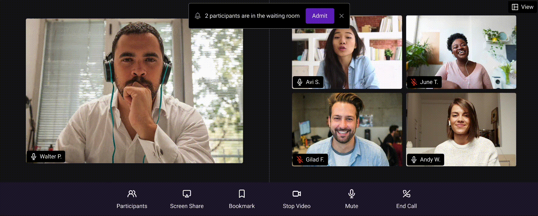
Based on usability testing feedback, we surfaced the Admit call-to-action within the banner message to reduce hesitation and streamline participant onboarding
A Real-World Challenge: Responsiveness at Scale
Eight months after delivery and one month post-launch, real-world usage revealed a critical issue:
the interface did not scale gracefully across extreme screen resolutions.
Working with PM and Engineering, we identified:
Engineering owned large-screen optimization
I owned small-screen usability constraints
Design Resolution
Collapsible question and chat panels
Priority given to live video area
Responsive layouts optimized for three key resolutions
Result: Preserved research integrity across diverse real-world environments.
Responsive layout update addressing large-screen resolution issues by optimizing panel structure and visual balance
Final Impact
Suzy Live transformed Suzy from a collection of research tools into a decision platform—one that directly connected participants, insights, and enterprise action.