
Background
Oracle HCM Cloud was built for desktop workflows at a time when enterprise usage patterns were rapidly shifting to mobile. As competitors like Workday and SAP advanced mobile experiences, Oracle faced a structural risk: incremental UI updates would not be sufficient to sustain long-term leadership.
This initiative was not a redesign—it required a fundamental rearchitecture of how HCM workflows, patterns, and performance operated across devices and business domains.
Outcome & Impact
Outcome
Delivered a comprehensive mobile-first rearchitecture across 100+ product areas and dozens of business domains
Established a new cross-HCM interaction model and UX pattern library
Launched globally in 2018
Impact
~$775M in new revenue within six months (+22.5% YoY)
~27M net user growth (Gartner 2019)
Oracle advanced to #1 global HCM cloud leader post-launch and retained leadership through 2025 (Gartner)

My Role & Leadership Scope
My Role
Senior UX Lead, Oracle HCM Cloud
Leadership Scope
Led mobile-first UX strategy across hundreds of product surfaces
Defined core interaction models and scalable UX patterns
Drove cross-team alignment across design, product, engineering, and central research
Balanced system performance, usability, and enterprise constraints at scale
Strategic Problem
How do you rearchitect a desktop-centric enterprise platform for mobile responsiveness—while preserving system integrity across hundreds of interconnected workflows?
Why This Was Hard
HCM workflows are long, stateful, and cross-module.
Legacy interaction models (e.g., train-stop flows) fundamentally broke on mobile constraints.
Any solution had to scale globally across products, teams, and devices.
Key Design Decisions
Decision 1 — From Horizontal Logic to Compact Guided Processes (CGP)
Strategic Move: Replaced legacy desktop "train-stop" patterns with a vertically progressive, task-completion-driven model optimized for mobile constraints.

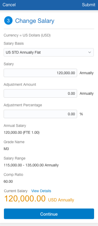
Outcome: Successfully translated long-form, stateful enterprise workflows into graceful, mobile-responsive experiences without losing data integrity.
Decision 2 — Systemic Density & Adaptive Rules
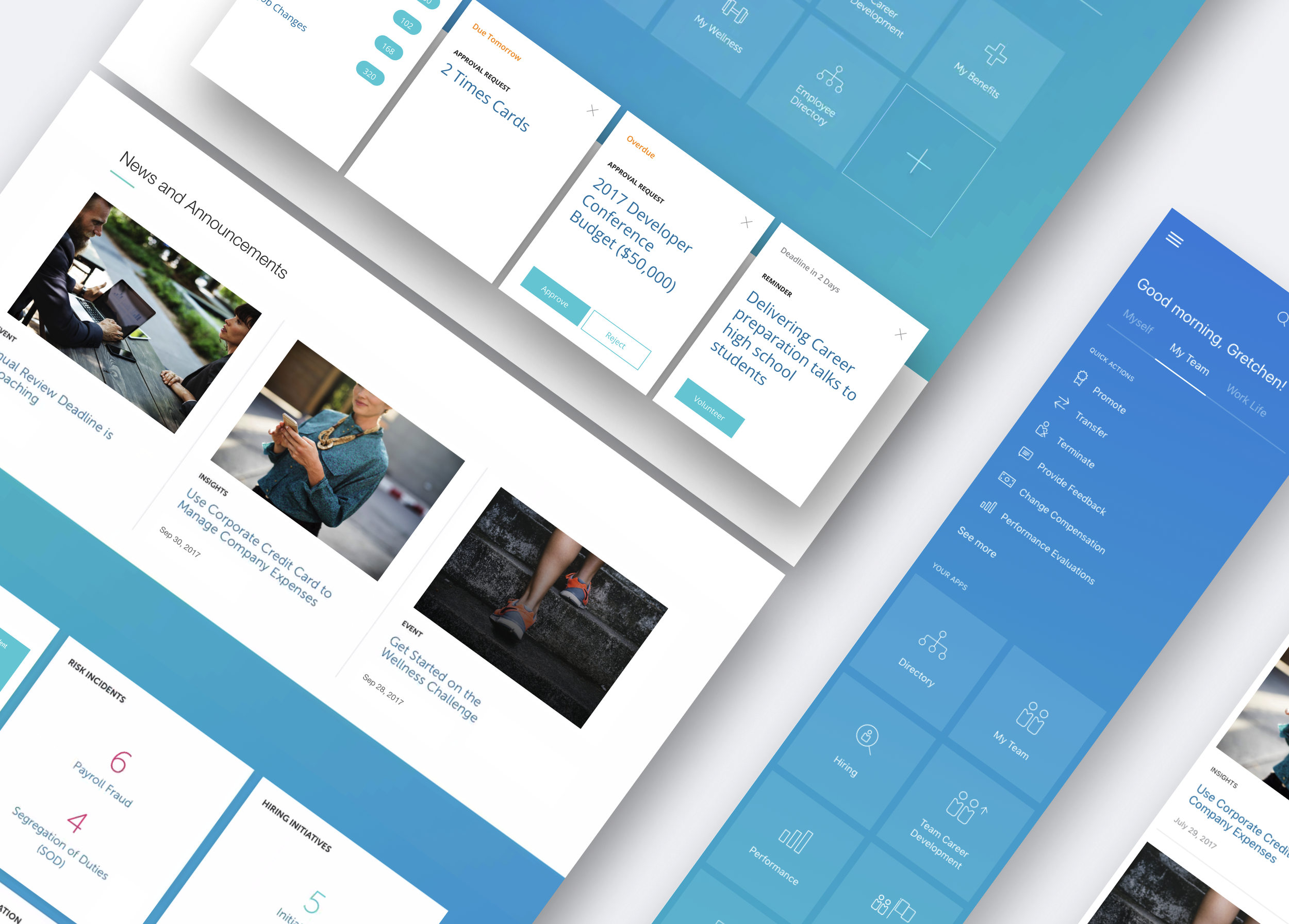
Strategic Move: Shifted from "screen-shrinking" to establishing system-level layout rules that governed density, edit/read modes, and content prioritization across all device classes.
Before Mobile UX

After Mobile UX
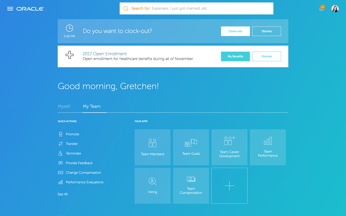
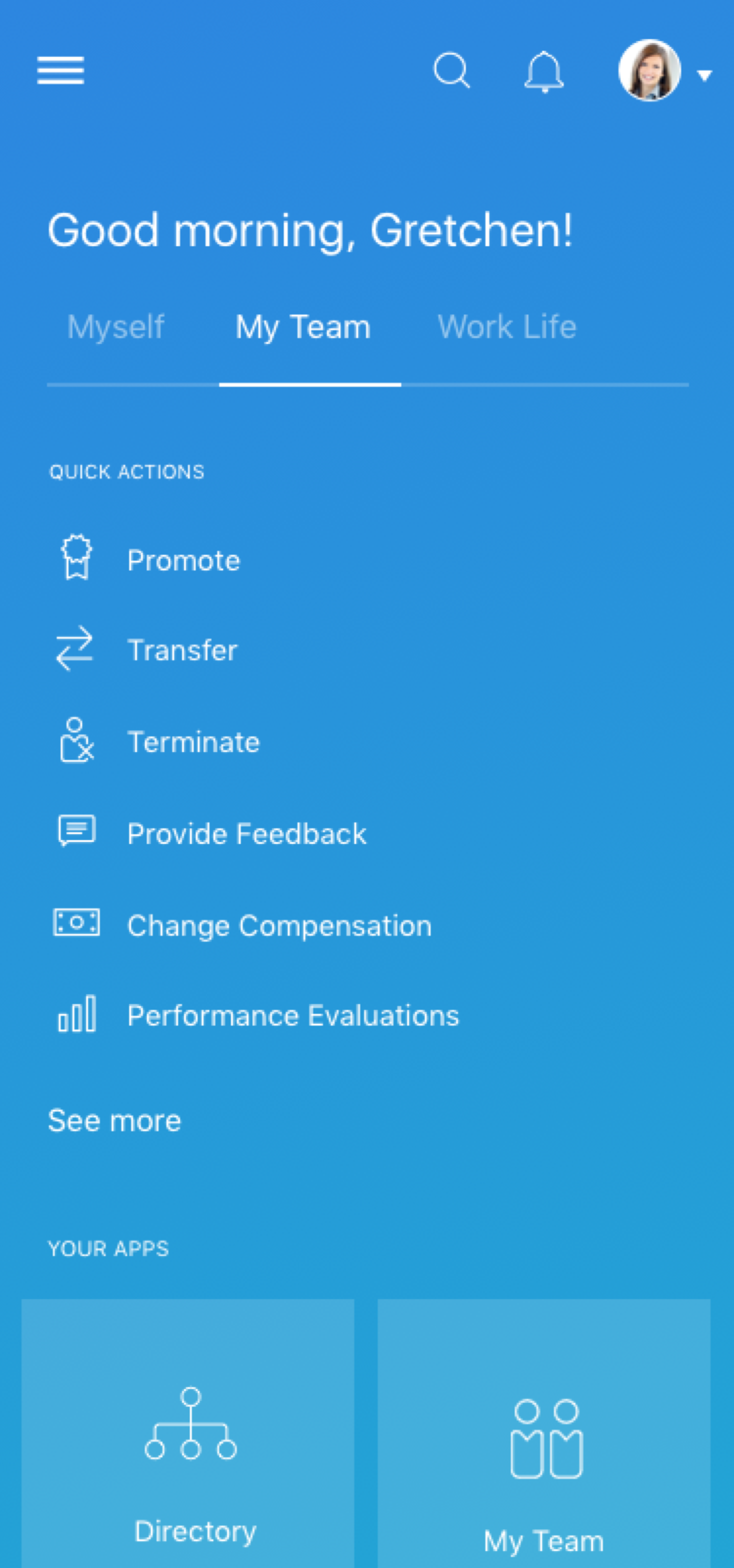
Outcome: Achieved a unified system and consistent usability across mobile, tablet, and desktop, eliminating the need for device-specific logic and reducing engineering overhead.
Decision 3 — Pattern-Driven Reconstruction
Strategic Move: Deconstructed page-based designs into a library of reusable interaction patterns and task flows that could be reassembled across disparate business domains.
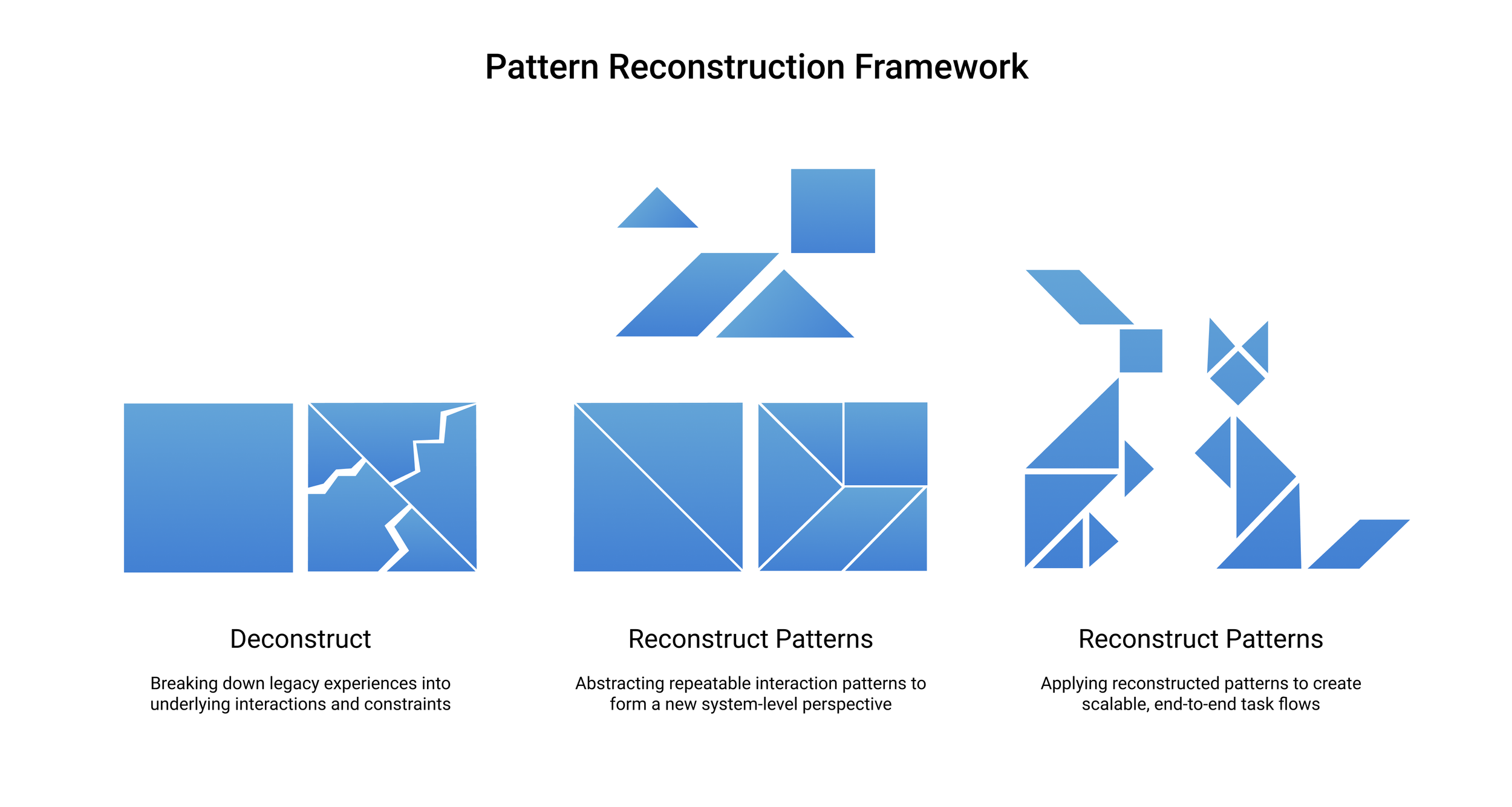
Outcome: Enabled rapid, synchronized delivery across dozens of product teams while ensuring a cohesive brand and user experience.
Evidence of Excution
Core Mobile Flows
Add Absence · Change Personal Details · Change Contact Information · Promote
These representative workflows demonstrate how the Compact Guided Process pattern scaled seamlessly across diverse HCM domains—from simple data updates to complex, multi-step manager actions.
Usability & Performance Validation
Efficiency at Scale
Central UX Research validated that the transition to mobile-first patterns directly improved task velocity.
Key Benchmark: The "Promote" flow saw a 60% reduction in completion time (from ~5 minutes to under 2 minutes), correlating directly with the rapid global adoption of the mobile platform.
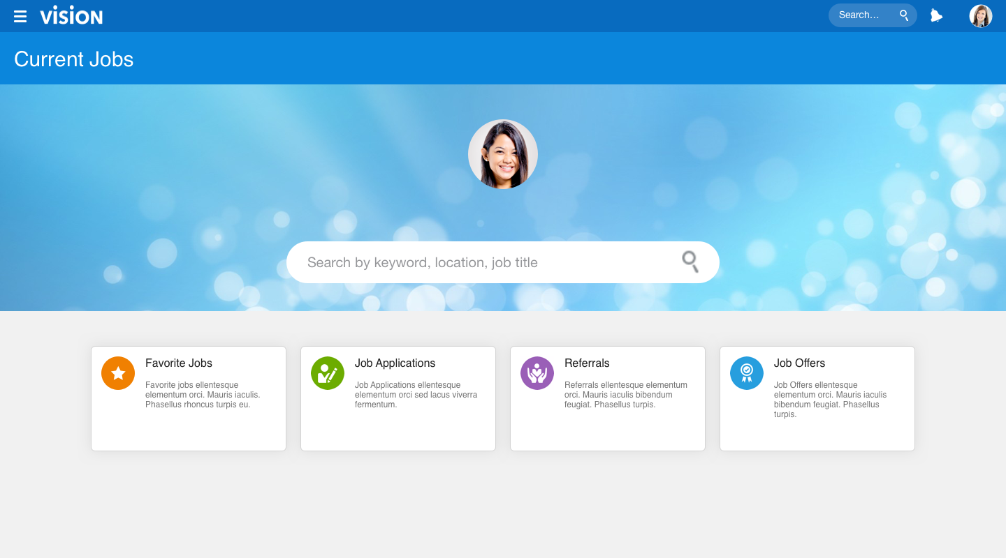
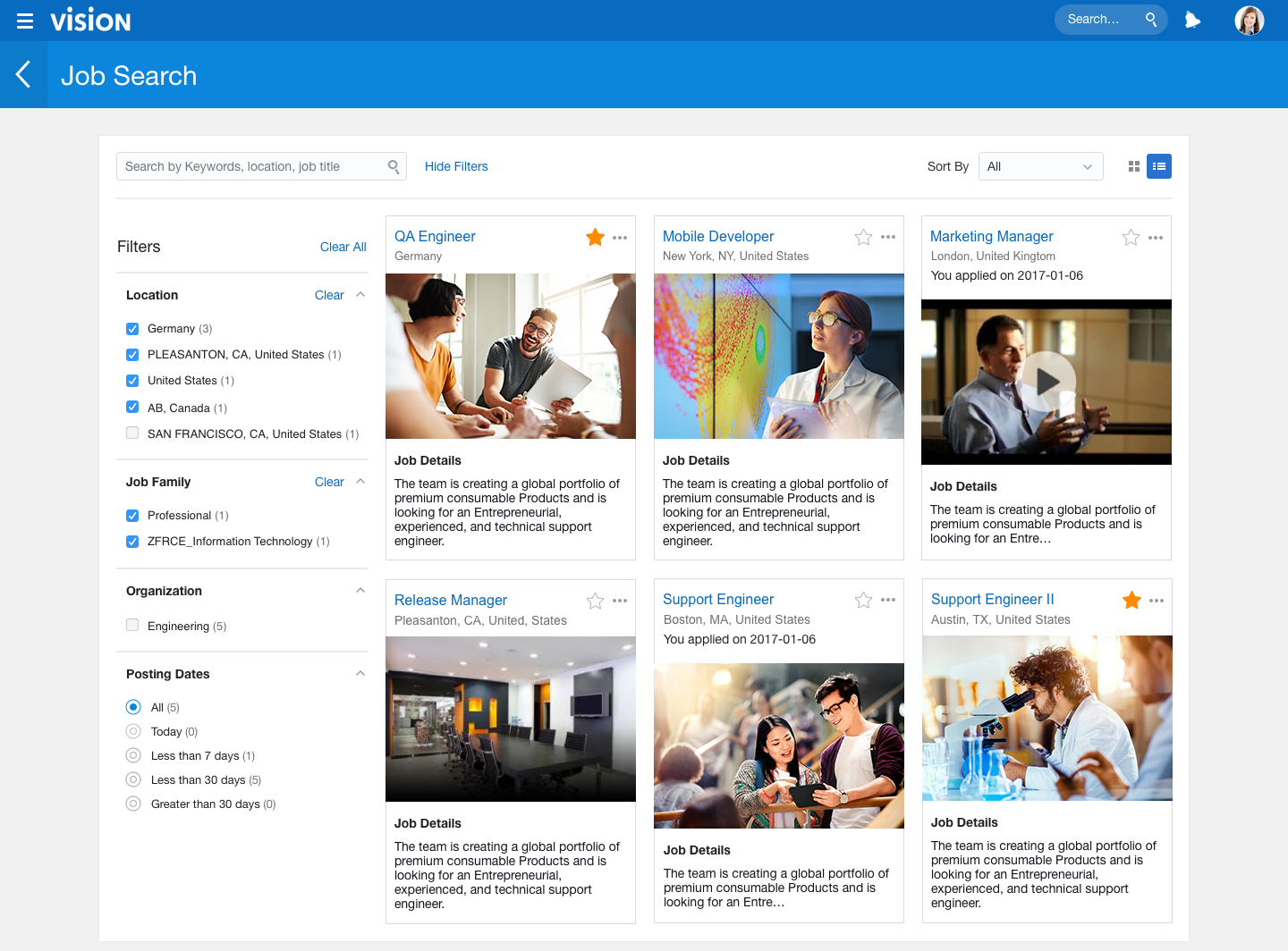
Scaling the System: Recruiting & Candidate Experience
After establishing the foundational mobile-first architecture, I led the application of these patterns to the Recruiting and Internal Candidate Experience (ICE) domains. This served as the ultimate stress test for the system, proving that the architecture could handle the high-volume, external-facing demands of global talent acquisition.
Representative examples:
ICE Landing Page
Job Search (Card View)
Final Reflection
This transformation was not about mobile UI—it was about resetting Oracle HCM’s interaction foundation for the next decade. By shifting from page-based design to pattern-driven systems, Oracle regained mobile competitiveness while preserving enterprise-grade scale and performance.